[How To] [FAQ] [Legal]
![]()
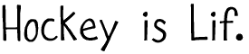 | Hockey is Lif (All keyboard characters, many foreign/special) Divide By Zero lives! After a three-and-a-half year break, I've finally got font-making apps living on my computer again. Here is a nice simple one I've been meaning to make for some time. (I am learning to play hockey, but I am really bad.) Happy 2002, 2003, 2004, and 2005! (14 January 2005) |
 | Tombats 7 (52 glyphs) -- It's another installment of the Tombats series! 7 is a special number around here, so I guess this font is special, too. Enjoy! (16 September 2001) |
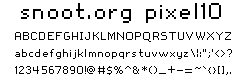 | snoot.org pixel10 (All keyboard characters, some foreign/special) -- I needed one of those cute screen fonts for one of my websites (snoot.org), so I cooked one up. It's just a tiny bit awkward, just the way I like it! The pixel-perfect size is 10 points with the windows renderer and, 14 points (??) with the Photoshop 6 text tool. For god's sake, don't anti-alias this, and don't use it for anything other than the screen. (18 June 2001) |
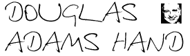 | Douglas Adams Hand (Caps=lower, some fudged punctuation) -- Douglas Adams, one of my favorite authors, died from a heart attack yesterday. Here's a font made from a handwriting sample he gave me in 1999 (with some fudged punctuation to make it usable). Contains a few traced pictures of him, too. Doug, I'll let you go on that pen you owe me... so long, and thanks for all the fish! (12 May 2001) |
| Music DBZ (Most Keyboard Characters (caps=lower), some foreign/special) -- This was my final font for my fonts class. It's really wide and script-like. Don't get too excited though; some words look great in this font, and other words look crummy. Anyway, try it out! (5 May 2001) | |
 | PROG.BOT (All keyboard characters, some foreign/special) -- I made this one for my fonts class ("Letterform Design") when the assignment was "play with Fontographer and make 3 letters" or something. I wasn't trying to be a smart-ass or anything, I just got carried away, and it was fun to make a font for the first time in quite a while. Sorry for the long break, guys! (5 May 2001) |
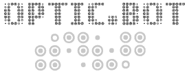 | OPTIC.BOT (All keyboard characters, some foreign/special) -- This is the complicated version of PROG.BOT above. It comes "first" because it is more powerful; it is PROG.BOT before Remove-Overlap. (5 May 2001) |
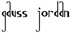 | Gauss Jordan (Alphabet (caps=lower) and some punctuation, some foreign/special) -- This one is named after mathematicians Gauss and Jordan who invented an important algorithm in Matrix Algebra. Matrix Algebra is pretty boring, though, which is why I created this font in my notebook while in Matrix Algebra class. No numbers, ironically. (29 July 2000) |
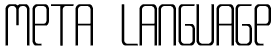 | Meta Language (All keyboard characters (caps=lower), some foreign/special) -- This one was sort of off the ladder too, but in sharp contrast to Potassium Scandal. I tried to make "Conspicuous Consumption", but the different-sized letters gimmick didn't come out well (you can superscript if you really want to type like that). This font works and looks really good, and is named after my favorite advanced programming language, ML. Enjoy! (14 April 2000) |
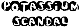 | Potassium Scandal (Most keyboard characters (caps=lower), some foreign/special) -- This font was high up on the fonts ladder. It's kinda gimmicky and grungy, but if you guys like it -- enjoy! Happy leap day! (29 February 2000) |
 | Tombats 6 (52 glyphs) -- New Tombats font! No specific theme here, but I've been "under the influence" of Pokémon and Halloween lately. Enjoy! (7 November 1999) |
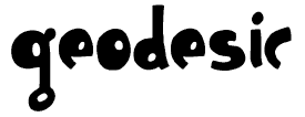 | Geodesic (All keyboard characters (caps=lower), some foreign/special) -- This font was leading on the Fonts Ladder for a long time (partly due to ballot stuffing!) and deserved to be made. It's all lowercase letters, but very usable. Be happy! (7 November 1999) |
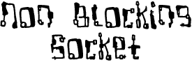 | Non Blocking Socket (All keyboard characters, some foreign/special) -- Spacey font for satellites and robots. This one would make a good makeshift antenna for your radio! I'm back in school now; that might mean lots more font fun! Very full character set, and lots of accent characters for my foreign friends! (21 August 1999) |
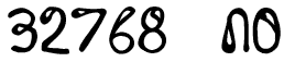 | 32768 NO (All keyboard characters (mostly caps=lower), some foreign/special) -- Font dedicated to my favorite nontrivial power of two. This is like a font made of needles, except they're really big and blunt needles which are bent around into a variety of impossible shapes. I'm really maximizing the use of the scanner these days because I'm going back to school in a month and won't have it... Meant for headlines. (25 July 1999) |
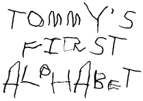 | Tommy's First Alphabet (Letters (Mostly Caps=Lower), bare punctuation essentials) -- Sorry about this one... when I found the worn piece of paper documenting this historic piece of my childhood I just had to make it into a font. All of the letters are authentic species from my first alphabet ever! Some punctuation has been fudged to make the font usable, but all the letters are real from when I was three and a half years old... (20 July 1999) |
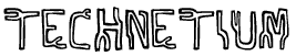 | Technetium (All keyboard characters (caps=lower), some foreign/special) looks kind of like a techno "Valium" (see fonts93). Evil and futuristic. Don't hurt yourselves! (10 July 1999) |
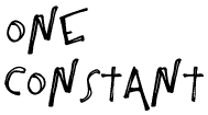 | One Constant (All keyboard characters (Caps=Lower), some foreign/special) was the leader for a while on the Fonts Ladder, so now it's a font -- I think it came out well. Good for headlines, workable as body text. (3 July 1999) |
| Lexographer (All keyboard characters (caps=lower), some foreign/special) is another font from my brother's boring party. Looks cool, I think! It also looks too much like "today" and "k bits" on the fonts ladder, so those are being retired. Dig it! (26 June 1999) | |
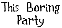 | This Boring Party (All keyboard characters, some foreign/special) is a font I made at my brother's boring Graduation Party (scan font). This font doesn't really know what it's trying to be, but it has its uses I'm sure. Enjoy! (20 June 1999) |
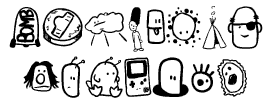
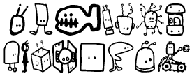 | Tombots (52 total glyphs) is the fifth in the TombatsTM series. This is the second themed tombats; the drawings are all supposed to be robots of some sort. Some are evil robots, some are kindly robots. Long live Tombats! (24 April 1999) |
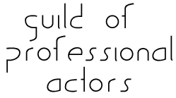 | Guild of Professional Actors (Alphabet, punctuation, some foreign/special) is an open, light, experimental font. It's missing lines where there should be lines. As far as I know, there's no such thing as the Guild of Professional Actors. Pain-stakingly precise! Enjoy! (24 April 1999) |
 | Conventional Wisdom (All keyboard characters (Caps=Lower), some foreign and special) is a font. Collect all 1,000,000,000! (23 April 1999) |
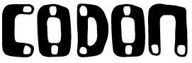 | CODON (All keyboard characters (Caps=Lower), some special) is yet another scan job, this time from Spring Break 99, where I was home sick with not one but two simultaneous illnesses. Now I'm back at school and all better! This font is like DNA, like magnets, like a biological agent. Heavy; best for headlines. By the way, I'm now officially a Communication Design minor here at CMU, hooray! (10 April 1999) |
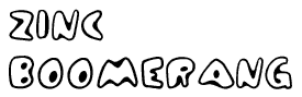 | Zinc Boomerang (All keyboard characters, some foreign and special) is a cartoony display font inspired by the wonders of static operational semantics inference rules. All the keyboard characters are available and more, but the capital and lowercase letters are the same. I think this font is really nice; enjoy! (9 March 1999) |
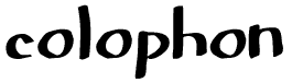 | Colophon (All keyboard characters, some Foreign and Special) is another scanned font from my Christmas '98 withdrawl. The capital letters have serifs, the lowercase don't -- I think this font looks good in all lowercase. Very smooth, almost cartoony, and suitable for both headlines and body text. (17 January 1999) |
| Cosine Katie (Caps / Lower [same], some punctuation) is a strange font which I made over my Christmas Break this year with some nice new pens I got. It isn't often that I make scanned fonts, but this is one! It's got a weird futuristic grafitti look to it, and it has only the lowercase letters and a little bit of punctuation. Type one of the missing characters for a picture of Cosine Katie herself, the only girl whose hair is a trigonometric function! (11 January 1999) | |
 | Tombats Four (52 total glyphs). Woo, another Tombats font! Print these out on stickers and paste them all over the place. I'm done with exams finally! Check out my notebook from this semester. Enjoy! (13 December 1998) |
 | Boring Boron (Caps, Lower, numerals, punctuation, some special / foreign) could maybe be called Tom's New Helvetica, but then it wouldn't be my first font starting with B and be my fourth Periodic Table font! The uppercase set of this was actually a font I made quickly as part of making Angstrom; I touched it up a little and finished it off. I love how delightfully inept this font is. Contains all keyboard characters, and more -- not to mention the Euro! (*snicker*) (3 December 1998) |
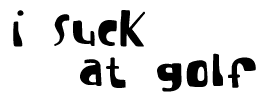 | I suck at golf (Caps/Lower [same], numbers, punctuation, some special). I really do suck at golf quite badly; I'm happy when I get the ball in the hole under 10 shots... (the postscript exporter shortens it to 'I suck at go' which is almost equally true). Bad news: I am currently experiencing repetitive stress injury in my wrist from all my typing, drawing, and keyboard playing. I'm probably going to be taking a break from the computer for a while. It might drive me insane, though, so conversely I might be back very soon. This font is all lowercase and suitable for headlines and goofy body text. Somewhat hand-kerned. (11 October 1998) |
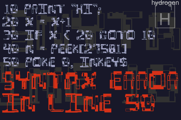
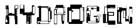 | Hydrogen (Caps/Lower [same], numerals, most punctuation, some special) is a really harsh digial font. Never use a computer which reminds you of this font. This is another in my Periodic Table series of fonts, and my first one starting with an 'H'. (3 September 1998) [demo] |
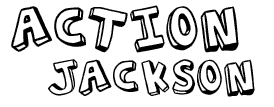 | Action Jackson (Caps/Lower [same], numbers, some Punctuation, some special). This is a sort of comic book action font. The letters are rotated and lit differently to give a dynamic feel. Hey! I'm back at school! Expect more fonts and Notebook Pages soon. I'm off to the track now ... Enjoy! (23 August 1998) |
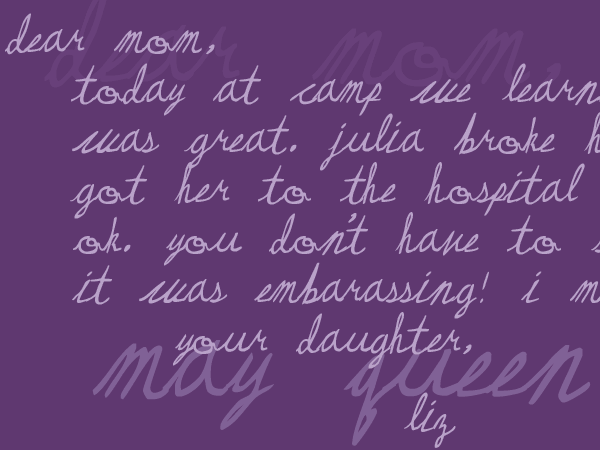
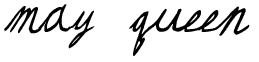 | May Queen (Caps/Lower [same], numerals (sort of), some punctuation and special) is my first cursive font; it looks best in a program that pays attention to the kerning, though at small sizes it doesn't really matter. This font is for Liz Phair. Come on Liz, put your new album out already! Hand kerned. (5 July 1998) [demo] |
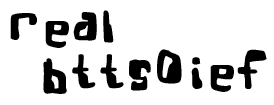 | Real Bttsoief (Caps/Lower [same], numbers, some Punctuation, some special). I put a full page of my handwriting into an OCR program at work (one of those things that takes scanned images of text and turns them into usable text format) -- the text it generated for the entire page, apparently an attempt to be insulting: "Real Bttsoief". This font doesn't look anything like my handwriting, but this is my big "Hey, screw you too!" to OCR software everywhere. Smallish, uneven, technology gone wrong. In other words, Real Bttsoief. It's kerned, hand hinted; Enjoy! (27 June 1998) [demo] |
 | Resurgence (Caps/Lower [same], numerals, some punctuation and special) is another from my school notebooks. It has an open, vaguely futuristic look, and is pretty readable at any size. There are no uppercase characters, so I think this is best suited for headlines or modern designs which don't use capital letters anyway. Kerned, hand hinted, Enjoy! (20 June 1998) [demo] |
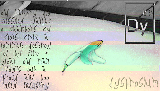
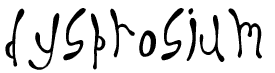 | Dysprosium (Caps/Lower [same], some Punctuation, some special), part of the Periodic Table series, I guess, is a sort of long, round, and excited font. Best suited for headlines. Kerned, hand hinted, Enjoy! (27 May 1998) [demo] |
 | Tombats Three (52 glyphs) - New Tombats font! 52 new icons, faces, drawings, etc. Some of these are really weird. And some characters from comic books I used to draw when I was little... Enjoy! (24 May 1998) |
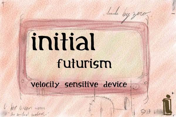
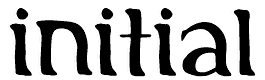 | Initial (Caps/Lower [same], Numbers, Punctuation, some special) is a really nice usable font to celebrate my last day of my first year of college. Check it out! I have to go to my math review session now... er, bye. (2 May 1998) [demo] |
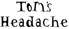 | Tom's Headache (Caps, Lower, most punctuation, some special) - is what my headache looks like right now. Not meant to be a pretty font. (The headache is caused by Too Much English Homework and Not Enough Money. If you are my English Teacher, stop giving me so many papers, and if you are Carnegie Mellon University, stop taking all my money.) This font looks good in all caps, but caps and lowercase are both there. (19 April 1998) |
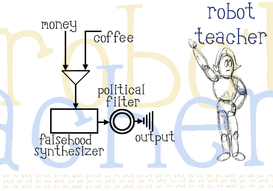
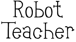 | Robot Teacher (Caps, Lower, Numbers, Punctuation, some special) didn't come out as I had planned, though actually I think I like this better. It's a child-like happy font which I can't really describe. Hand-hinted and properly kerned. All of the keyboard characters are there -- enjoy! (11 April 1998) [demo] |
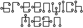 | Greenwich Mean (Caps / Lower [same], some punctuation, some special) - is a nice even electronic circuit-board type font. A very faithful reproduction of what I drew in my physics notebook. I'm sorry it's been ages since I've done a font, folks, but I'm back at it and it feels good. Hand hinted for small sizes, but it works best for headlines. Enjoy! (12 March 1998) |
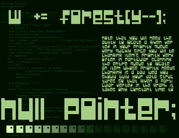
| Null Pointer; (Caps/Lower [same], numbers, most punctuation, some special) I guess is named this because people keep thinking I'm a physics major with all my physics-named fonts. I'm in Computer Science! This font is heavy and computerish, with no diagonal lines at all. Most of the keyboard characters are there. (29 January 1998) [demo] |
![]()
Back to the [ Divide By Zero ] index.
Back to Tom 7's Page. (lots more exciting stuff, I promise!)
A button to link with! |