[How To] [FAQ] [Legal]
![]()
| Antimony Blue (Caps, Lower, Numbers, most punctuation, some special) - is a pretty difficult-to-read futurist font. I think it actually does look cool when used for a lot of text (as opposed to just a headline), and I've included uppercase and lowercase, numerals and most punctuation. It's well hinted so it looks okay even at small sizes. (3 December 1997) | |
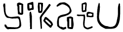 | Yikatu (Caps/Lower [small caps], numbers, most punctuation, some special) is the name of a sort of Club that I made up with my cousins when I was a wee child; here is the font in honor of that now defunct (?) organization. It will work for headlines or body text, though perhaps a little cryptic. (17 November 1997) |
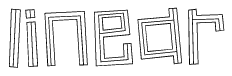 | Linear (Caps/Lower [same], some punctuation/special) - to celebrate my 100,000th hit (!) I've tried to bring you some Old School Tom 7 fontage -- this is a face which has appeared in my notebooks sporadically for quite a long time. It's for headlines only, and though I did hand hint it, it does quite a number on low-resolution bitmap displays. It is best suited for 48-point or larger printed headlines. (16 November 1997) |
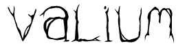 | Valium (Caps/Lower [same], some punctuation/special) is a sort of twisted, evil-looking typeface. "It is like an overgrown tree, like a viny magic staff, like a dangerous virus." ... (14 November 1997) |
| Natural Log (Caps, Lowercase (lots of repetiton, but some are different), some punctuation) is a rather simple font, following the design philosophy that the absence of the expected is as striking as the presence of the unexpected. This would work for body text, but be careful as there are no numbers (see, lack of the expected! ;)) Hand kerned -- I'm never doing that again! (2 November 1997) | |
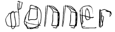 | Donner (Caps/Lower [same], numbers, some punctuation/special) is the name of my residence hall at college. If you were freezing to death and writing in blood with a sharpened stick, this is what it might look like. I would recommend this for headlines only, and it is somewhat difficult to read at small sizes. (28 September 1997) |
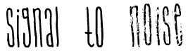 | Signal To Noise (Just Lowercase, Caps) has two sets of characters, the lowercase are clean ('signal to' at left) and the uppercase are noisy ('noise' at left). The letters are tall and thin unicase characters. Designed for headlines only. (25 September 1997) |
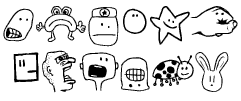 | Tombats Smilies (53 total glyphs) is my second Dingbats (Tombats) collection, this time with a "smiley face" theme -- though to be perfectly fair, only 34% of them are actually smiling. Let me know what you think of Tombats vs Regular Fonts, I can be equally prolific with both (though these do take a bit longer). (16 September 1997) |
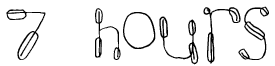 | 7 hours (Lowercase/Caps [same], Numbers) is how much time I'm supposed to be spending per week on Physics; here's what I did instead. Actually it's been quite busy since I've gotten to college so my previously prolific nature has suffered somewhat. Hopefully soon I will be Back In Action. In any case, this is a line-based font with, well, I don't know what to call them. Look at the picture. Designed for headlines only. (6 September 1997) |
 | Angstrom (Caps/Lower [same], Some Punctuation, Some Special) is a blurry techno-looking headlines font. Looks better at large sizes. (31 July 1997) |
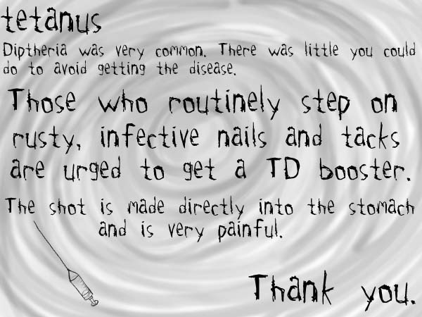
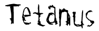 | Tetanus (Lowercase, Caps, Numbers, some Punctuation/Special) is a typeface made to look somewhat like barbed wire twisted to shape letters. It looks good both in all lowercase/capitals and mixed case. Good for headlines and acceptable body text. (25 July 1997) [demo] |
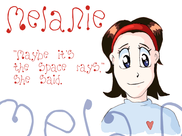
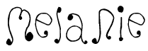 | Melanie (Caps/Lower [same], Some Punctuation, Some Special) is as girly a font as I could make. There are big dots as serifs, and the strokes are very loopy and decorative, yet uneven and cartoony. Or rather, it's Girly. There is only a lowercase (more like unicase) set, so it is best used for headlines. (14 July 1997) [demo] |
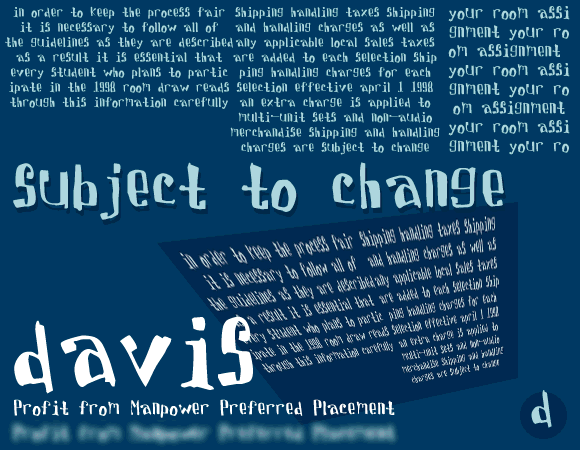
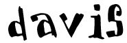 | Davis (Lowercase, Caps, Numbers, some Punctuation/Special) is a quasi-computerish but messy typeface. It looks good in all lowercase (at left) as well as with the standard capitalization. Works very well for headlines and is also readable as body text. (4 July 1997) [demo] |
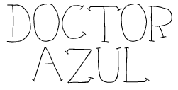 | Doctor Azul (Caps/Lower [same], Numbers, Most Punctuation, Some Special) is a handwriting-like font with serifs and little diagonal thingies that I don't know the typography term for. Mostly for headlines; I may do a lowercase set eventually. Hand Hinted! (20 June 1997) |
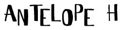 | Antelope H (Lower/Caps [see below], Numbers, some Punctuation/Special) is my Top-hat style Headline font (thus the 'H'). To get the font to look staggered, as at left, you alternate uppercase and lowercase: AnTeLoPe H. You can also use straight caps or lowercase to get a more even look. I may eventually do a lowercase set and make a regular 'Antelope'. Hand hinted! (8 June 1997) |
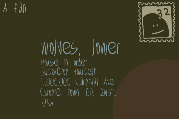
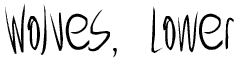 | Wolves, Lower (Caps, Lower, Numbers, Most Punctuation, Some Special) is a more rapid version of my handwriting using a quill pen. Works for headlines or text, though it is messy! (6 June 1997) [demo] |
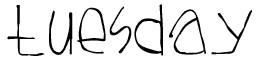 | Tuesday (Lower/Caps [same], Numbers, some Punctuation/Special) is another handwriting-like font with a low midline and where nothing drops below the baseline. It is all lowercase characters (the uppercase characters appear lowercase, but are present). Works for text as well as headlines, though for some of the less common punctuation you may need to substitute fonts. (3 June 1997) |
 | Tombats One (Caps/Lower - 52 total glyphs) is my first dingbats collection, aptly entitled 'Tombats'. There is no specific theme, except that almost all of the glyphs have a cartoony feel to them. Expect more in the Tombats series soon! (27 May 1997) |
 | Fresnel (Caps/Lower [same], Numbers, some Punctuation) looks sort-of like letters through a bad Fresnel lens. Looks best at large sizes! (In fact, since it is difficult to see the effect at all at small sizes on the computer screen, there's the top of a large F in grey at left as well.) (25 May 1997) |
| Submerged (Caps only) has large bold capitals submerged in sort of a blobby thing. Intended for headlines only. | |
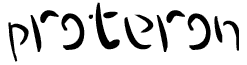 | Proteron (Caps/Lower [same], Numbers, some Punctuation, some special) is a vaguely quill-like font, with exaggerated strokes and the oft dropped line. An interesting font, albeit difficult to read at smaller sizes. Definitely not recommended for body text. |
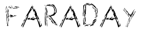 | Faraday (Caps only) is a caps-only font for headlines. The letters are light and internally jagged. This is my first font with my brand new Wacom ArtZII drawing tablet. Expect more soon! |
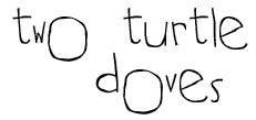 | Two Turtle Doves (Caps, Lower, Numbers, Punctuation, some special) would be a good font to do a really important Term Paper in. The letters have different sizes and basepoints, giving a very child's-handwriting look. Readable at small and large sizes. At large sizes the lines have genuine width and shape (the line width varies) which is not as visible here. [demo] |
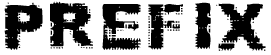 | Prefix (Caps, lowercase, numbers, some punctuation, some special) is a kind of futuristic-sci-fi-movie-type font. The font works well for headlines (especially in all caps), though lowercase characters and most punctuation is included, and the font is mostly readable at smaller sizes. |
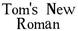 | Tom's New Roman (All characters) is my replacement for the dreaded Times New Roman. The letters have slightly varying sizes and carry a hand-drawn look (because in fact they were). They also look much better than Times Roman when at large sizes. The text is readable at small point sizes, and all characters are included for complete compatibility. Also, this is more than a simple effect applied to the Times Roman font -- each character was drawn from scratch. |
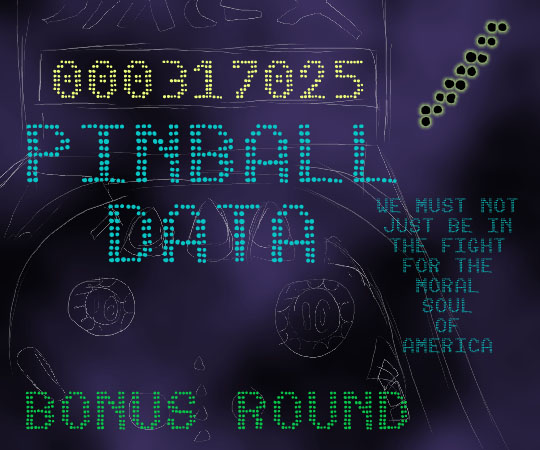
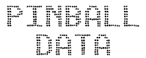 | Pinball Data (Caps, numbers, punctuation, some special) is a typeface which mimics a pinball-type dot matrix display with slightly uneven dots. The font is excellent for headlines (caps only), and is best in large sizes. Includes all common punctuation and some special characters. Monospaced. [demo] |
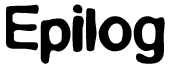 | Epilog (Caps, lower, numbers, punctuation, some special) is a pleasant and roundish font. The letters are smooth and heavy. Epilog includes all common-use characters, and is readable at small sizes, so is excellent for both text and headlines. |
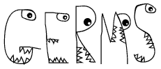 | Germs (Caps, most punctuation) is a typeface I used to draw all the time when I was a kid -- each of the letters is made into a monster with sharp ravenous teeth and a glaring eye (sort of). Only really suitable for headlines; it is caps only and the font is difficult to read when small. |
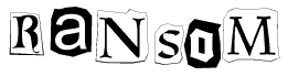 | Ransom (Caps, lower, numbers, some punctuation) is a ransom-note type font, made up of at least 20 type faces in both regular and inverse. Excellent for headlines and for actual ransom notes, but really shouldn't be used for text. |
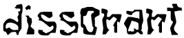 | Dissonant Fractured (Caps, lower, numbers, some punctuation) is a scary gothic-looking font. It is best suited for headlines and decorative purposes, but is readable as small as 10 point. |
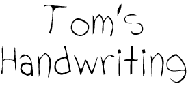 | Tom's Handwriting (Caps, lower, numbers, punctuation, some special) is a scanned and autotraced font of my handwriting. It can be used for text as well as headlines. Quite cute, I think. =) |
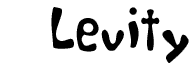 | Levity (Caps, lower, numbers, punctuation) is a happy-looking font, also designed for headlines (but will work perfectly well for text as well). Heavy, rounded characters. |
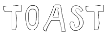 | Toast (Caps only) is designed for headlines only. An elegant (ha!) outline font with that hand-drawn look. |
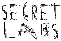 | Secret Labs (Caps only) is the hallmark font of Secret Labs, Inc., which nobody has ever heard of (because it's a secret!). A very messy but interesting font, suitable for headlines only. |
![]()
Back to the [ Divide By Zero ] index.
Back to Tom 7's Page. (lots more exciting stuff, I promise!)